Narratives in Time and Space
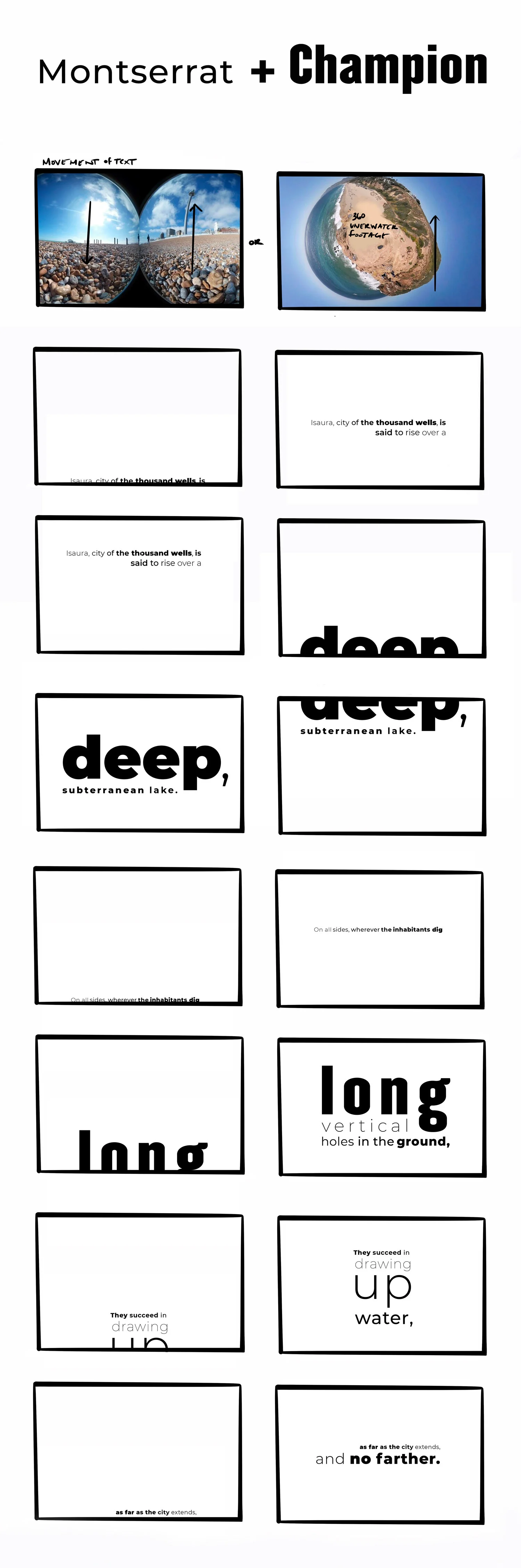
We were each assigned a section from Italo Calvino, Invisible Cites. We were instructed to use live action video and animated text, to create a typographic narrative that captures the story of, and gives life to the city as Marco Polo is describing. Emphasis was placed on efforts for the text to interact with the live action video.
Reflection
Invisible Cities written by Italo Calvino explores the imaginary cityscapes described by the explorer, Marco Polo. Presented through a lens of abstractions, the text is arranged in eleven groups (cities and memory, cities and desire, cities and signs, thin cites, trading cites and eyes, cities and names, cities and the dead, cites and the sky, continuous cities and hidden cities,) all of which are tied to the imaginary characteristic of fictional places. The significance of the cites service as a catalyst for contemplation of human civilization, values and the nature of storytelling. While the typography is literal, just like the word cities, I intended to capitalize on the subtleties presented in the typeface Montserrat. Invisible Cities could be interpreted as “fictionally literal,” but more likely could also offer endless possibilities for invented interpretations and metaphors. Representing this concept through the use of type treatment called for choosing a typeface with a variety of styles. I was particularly drawn to this historical aspect of this typeface, quite literally being conceived on fading memories of distinct typographic elements in a changing urban landscape.
Type Choice
Montserrat, designed by Julieta Ulaovsky, is a san serif family with lots of variety. Geometric in style, the family has a wide range of subtle optical adjustments reflected by its original inspiration. The typeface is inspired by the old signage found in the historical neighborhoods of Buenos Aires. The intention of the typeface was to rescue the beauty of urban typography from the first half of the twentieth century. As urban development improves city spaces, it can sometimes come with a cost. Development can overhaul the neighborhood’s original, unique characters marked by old typographies and canopies irretrievable when replaced. These quaint nuances give beauty and life to urban spaces.
Champion is a san-serif typeface designed by Jonathan Hoefler . Many of Champion’s weights are translations of classic wood typefaces, which lend the family to slight mismatches providing an eclectic quality to the fonts. Champions unique diversity in styles could reflect the distinct characters and cultures found in an urban landscape. Each weight of Champion feels like it’s own typeface because they don’t obey a particular obligation to one another.